Adaptive Vs. Responsive: The Spectrum Problem
2014-08-01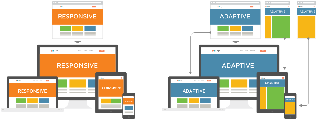
Adaptive Vs. Responsive: The Spectrum Problem
My first fully responsive project, was building the front-end of what would be a large human resources website. Being a novice in the responsive craft at the time, I read everything that I could in order to adopt the best possible solution. I researched CSS frameworks, fluid grids, and popular screen resolutions. Then I came across a strange term, adaptive design.
After some research it was clear that there was some discrepancy within the development community as to what exactly was the difference between the two. Despite being thoroughly confused after a few hours of research, ultimately I came to the understanding that adaptive design meant a site was to be built for a set predetermined screen resolutions or breakpoints. Responsive design, on the other hand, meant the site would cover all possible screen resolutions, with seamless breakpoints.
The problem I found with that particular project was that I was handed three designs, at three breakpoints (1152px, 768px, 480px), but the layouts changed so much that it was clear my responsive project was in fact destined to be adaptive. Hell bent on meeting the true responsive definition, I was left to fill in the middle ground and learned a lot as I struggled to extrapolate the design and make the transition between resolutions appear seamless.
After battling the frustration of that first project, I had come to the conclusion there were two options, a fixed width layout, or a fully responsive solution. Adaptive just felt like a dirty word to me. I wanted the site to move like liquid, casually filling it’s container perfectly at every browser resize. Then I learned about timelines, cost constraints, and client interference.
A fully responsive site usually requires a full redesign of the previous site, and last minute changes can leave you tearing your hair out in frustration as your beautiful liquid mercury terminator get’s shredded to bits. You don’t always get the option of a full redesign, and you don’t always get the option of executing your vision completely.
What many clients want, is something in the middle–something that makes both money and it’s launch date.
The Spectrum Problem
Today I work integrating third party software modules into e-commerce sites, where the term responsive has become a buzz word. The question in scoping conversations is always posed, “is your site responsive?” And a response of yes from an ecom director or marketing coordinator can mean just about anything from a completely fluid layout to a separate mobile (m.dot) template.
From a designer / developer perspective the correct rhetoric would be is your site adaptive or is it responsive? However, does this really cover it? Are all sites that are mobile optimized sitting within one of these two predefined camps?
The short answer is no.
What I have found is that most mobile optimized sites today (and I specify mobile optimized because some people still forgo mobile all together) exist on a spectrum. Much like in geometry, where a square is technically a rectangle which is also a parallelogram, but not the other way around–responsive sites are adaptive and are also mobile optimized, but not necessarily vice versa.
In the space of mobile web development, we encounter a wide array of hybrid solutions. If we try to define the whole of the mobile web in two camps, then we leave out the gray areas that exist, we lose the ability to scope a project effectively, speak intelligently with our clients, and get the full picture to our development team.
But where do we begin finding out what approach or combination of approaches were used?
Device or Window-Size Detection
There are two main ways that a website decides how to adjust its layout.
1. Device Detection: Triggers new code based upon the device being used. This can either be done on the client-side by media queries in the CSS, or server-side code.
2. Window Size: Triggers based upon the size of the browser window. This is typically done on the client-side using media queries in your stylesheet, but is also achievable, though inefficient, using javascript.
When a site relies upon device detection, we are looking at a site firmly on the adaptive end of the spectrum. When we look at window-size, we begin to tip towards the responsive end of the spectrum, but may not be all the way there yet.
Take a look at the below CSS to see how this would look in standard media queries.
/* Device Detection */

@media screen and (min-device-width: 768px) and (max-device-width: 1024px) { ... }

/* Window Size Detection */

@media screen and (min-width: 768px) and (max-width: 1024px) { ... }
Not too much of a difference there, but in terms of behavior, min/max-width will work when the browser is resized, whereas min/max-device-width requires a mobile device or simulator to trigger. For this reason device detection is often the most bothersome to work with. It also does not account for a user using a smaller browser window on their desktop or laptop, causing an annoying horizontal scroll. For the best user experience, and adherence to true responsive design principles we are seeing window-size detection become most popular.
But then how do we define these terms simply?
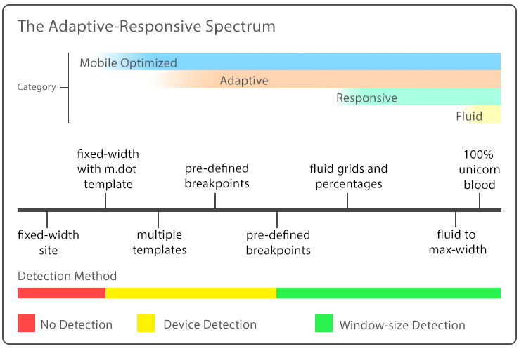
The Spectrum Defined
Going back to the geometry example, what I propose are a few major definitions, or buzz words if you will, each nesting within one another like Russian matryoshka dolls. A spectrum allows us to see the gray areas created as sites bring themselves into the mobile era.
Mobile Optimized
This encompasses any site with even the most primitive of mobile capabilities–all the way up to full on digital liquid mercury. It’s just vague enough to show you have a clue where the current trends are going, but not specific enough to be presumtuous of anything ground-breaking. It shows the existence of a strategy, albeit it may be a poor one. A client solely in this category and none of the others will typically have a separate mobile site or single m.dot template.
Adaptive
Adaptive design takes the approach of setting the template to shift at predetermined widths or breakpoints. Traditionally this could either be done by serving up a new templates based upon device detection, or through media queries utilizing the same template.
The advantage of serving separate mobile templates is that each device is served only the content optimized for that device with nothing extra loaded. Images, styles, and HTML are only that which is required–this is not the case when we move over to responsive. That being said, the media query method is gaining favor–with faster development times and being closer to responsive on the spectrum of mobile design.
When done by media query, adaptive sites can either specify device-width or window-width, but the site will appear to snap at the specified breakpoints to the next layout. One can see that in the adaptive definition alone there is a spectrum, but it’s beginning to narrow.
If you are on a desktop, take a look at this example. I’ve made the break points a bit more drastic to emphasize the effect but be sure to take a look at how the Site content snaps to the next width. I used the window-size detection method so you can simply resize your browser window rather than load in a device.
Responsive
Responsive design means that the site will respond to any device constraints thrown at it. It involves the use of percentages for element and font size, fluid grids, and will scale the layout according to window-width not device-width. This is the latest craze in web design as it is the most forward thinking by ensuring consistent layout despite the myriad of new devices and screen sizes released each year.
The criticism here is that the site is not serving up only what is required for that device–potentially resulting in a loss of performance. The advantage being, one template can fit any device or window size possible, without a loss of user experience.
Does this mean that a responsive site is not also adaptive? No, it most certainly is adaptive, it’s just more graceful than other adaptive methods. But is an adaptive site also responsive? Not necessarily.
If you are on a desktop, take a look at this example. When you resize the window, you can see that rather than snapping to specific points, a fluid grid scales on it’s own, reconfiguring the layout when necessary at smaller resolutions.
Traditionally that would cover it for definitions, but I would like to add one more…
Fluid Responsive
This is the stuff web applications are made of, and what I consider to be the holy grail of web design. It’s often not possible for more complex sites to achieve this status but it is becoming more popular with time. This is the digital liquid mercury I refer to, just pure unicorn blood. These sites will scale infinitely relying wholly on window-size detection just like their responsive parent, however they will never shift layout as is common with fluid grids. They often have to maintain a single column throughout, much like this blog, as two columns in a smart phone gets awful cumbersome.
Again, if you are on a desktop, see this example. As you can see the two colums scale infinitely without any change in layout. This type of site only works for very specific applications, as e-commerce sites in particular often have many different elements that would be better suited to the responsive design principle, but not full fluidity. Though rare, it is worth noting this type of site as it requires extra care to achieve this.
For The Visually Inclined
Here is a graphic to showcase the above definitions. If you are an account or project manager and in the business of scoping projects, the development time will typically increase as you go from left to right on the spectrum.
You can also check out this video on teamtreehouse.com for some additional clarity.
In Conclusion
These definitions in themselves do not clear up the multitude of methods or combination of methods used on the web today. I have seen partially responsive sites down to a certain width where they switch to an m.dot layout; and sites that scaled all the way down to mobile using a fluid grid but when loaded into a device pull up a completely different template. Hence the need to understand this as a spectrum rather than trying to categorize every site into two distinct categories. This is especially important when asked to scope a project, whether it be a full site rebuild, or a module living inside an existing layout.
The jumble of different ways businesses have attempted to bring their site into the mobile revolution is not influenced simply by purity of development but also by cost and usage constraints. Often we like to divide things into black and white, but there is a big gray area today in the mobile web, and the sooner we recognize it, the sooner we can adapt our business practices to it.